Design System: chojecki.net
Overview
Creative North Star: “The Independent Field Notes”
The system feels like a well-kept personal notebook published on the open web: clean enough to trust, informal enough to reveal a person, and structured for curious browsing rather than conversion. It uses familiar system typography, a paper-and-ink foundation, and small Cherry Ember signatures so the content stays primary.
Its mood is clean, pragmatic, and intellectually curious. Surfaces are softly layered, components are crisp and restrained, and personality arrives through real photographs, first-person writing, a hand-drawn headline underline, the cherry identity, and a few purposeful motions—not through spectacle.
The result must never drift into a flashy designer portfolio or a corporate résumé and consulting profile. Preserve quiet confidence: evidence and personal detail carry the experience, while the interface remains legible, direct, and owner-made.
Key Characteristics:
- Paper-like light surfaces with a complete charcoal dark counterpart.
- System sans typography with bold, tightly tracked display moments.
- Cherry Ember and Deep Terracotta used as signatures, links, focus, and progress.
- Soft layering through hairline borders and low-contrast ambient shadows.
- Personal details and motion that reward attention without interrupting reading.
Colors
The palette is warm but restrained: neutral paper and ink dominate, while the orange family works as an authored signature and the dark theme preserves the same hierarchy with warmer links.
Primary
- Deep Terracotta (
deep-terracotta): the primary interaction color for editorial links, focus rings, and active navigation. - Cherry Ember (
cherry-ember): the personal signature used for reading progress, theme chrome, and sparse moments of emphasis. - Vivid Ember (
vivid-ember): used at partial opacity for the hand-drawn headline underline; it is not a general surface color.
Neutral
- Ink (
ink) and Paper (paper): the default text and canvas pair. - Slate (
slate): secondary copy, navigation, neutral controls, and metadata. - Soft Paper (
soft-paper) and Hairline (hairline): quiet tonal surfaces, dividers, tag fills, and footer structure. - Dark Canvas (
dark-canvas), Dark Shell (dark-shell), Dark Surface (dark-surface), and Dark Raised (dark-raised): the dark-theme depth ladder. - Dark Ink (
dark-ink) and Dark Accent (dark-accent): dark-theme reading text and interaction emphasis.
The Ember Signature Rule. Orange is a marker, not a wash: use it for links, focus, active state, progress, and the headline stroke rather than large generic panels.
The Paired Theme Rule. Every new neutral surface and interaction state must work in both the paper light theme and the charcoal dark theme.
Typography
Display Font: the native system sans stack, with platform-appropriate fallbacks. Body Font: the same native system sans stack. Label/Mono Font: the system sans for labels; Monaco, Consolas, and Lucida Console for code.
Character: The single-family system is deliberately direct and unbranded. Hierarchy comes from scale, weight, tracking, measure, and spacing rather than decorative font pairing.
Hierarchy
- Display (700, responsive display token, 0.9 line-height): the home greeting, with tightly tracked emphasis on Patryk’s name.
- Headline (700, responsive headline token, 0.98 line-height): page titles and the strongest section openings.
- Title (600, title token, 1.3 line-height): project-card titles and compact component headings.
- Body (400, 1rem, 1.55–1.58 line-height): long-form first-person writing; keep paragraphs at or below 64 characters per line.
- Label (700, label token, 0.035em tracking): metadata, small navigation, statuses, and supporting controls; uppercase only where the implementation already uses it.
The System Voice Rule. Use the incumbent system stack for both display and body roles; personality comes from composition and copy, not ornamental typefaces.
The Reading Measure Rule. Long-form prose stays at a maximum of 64ch even when the surrounding layout is wider.
Layout
The site is a reading-first responsive shell. The main container is capped at 860px with 1em side padding. At the 925px desktop breakpoint, the author profile occupies a narrow left rail and the primary page or archive content occupies the remaining reading column; at smaller widths the author identity becomes a compact horizontal row above full-width content.
Spacing follows a compact quarter-rem rhythm, with 0.5rem and 1rem as the common component steps and 1.5–2rem reserved for section separation. The project archive is a one-column grid by default and becomes two equal columns from 600px. Navigation uses a priority-plus pattern, keeps visible destinations on one line where possible, and moves overflow into a compact dropdown.
Responsive decisions align to the established 600px, 768px, 900px, 925px, and 1280px breakpoints. Interactive targets remain at least 44px on touch layouts; content may compress, wrap, or stack, but it must not reduce the reading measure or target size to preserve a desktop composition.
The Reading Column Rule. Let the shell organize the page, but let the 64ch prose column control comprehension.
Elevation & Depth
The system is softly layered. Most structure comes from paper-toned surfaces and 1px borders; low-contrast shadows distinguish objects that genuinely sit above the page, such as the portrait, dropdowns, form fields, code, and image hover states. Project cards remain bordered and mostly flat at rest.
Shadow Vocabulary
- Ambient Low (
0 4px 16px rgba(0,0,0,0.06)): inline code, table-of-contents panels, and form fields. - Portrait Lift (
0 10px 28px rgba(0,0,0,0.08)): the circular author portrait; dark mode increases opacity to maintain separation. - Overlay Lift (
0 0 10px rgba(0,0,0,0.25)): dropdowns and image hover states; dark mode may increase it to 0.5 opacity.
The Soft Layer Rule. Elevation must explain stacking or interaction; never add heavy shadows merely to decorate a static surface.
Shapes
The form language is gently precise. Most controls, code, and overlays use a small 4px radius; substantial project cards and project imagery use 8px. Tags and the headline stroke use a full pill radius, while portraits, avatars, status dots, and the theme toggle are circular.
Hairline 1px borders carry most structure. The deliberately imperfect element is the Vivid Ember headline stroke: a slim pill rotated by -0.8 degrees beneath the text, giving the otherwise crisp system an owner-made mark.
The Radius Hierarchy Rule. Use 4px for controls, 8px for contained content, 999px for tags and strokes, and 50% only for genuinely circular objects.
Components
Components are crisp and restrained: compact padding, visible states, quiet borders, and no decorative chrome that competes with the writing.
Buttons
- Shape: gently rounded (4px) with compact 0.5em × 1em padding.
- Primary: Slate fill with Paper text and bold compact labeling.
- Accent: Deep Terracotta fill with Paper text; reserve it for meaningful informational actions.
- Inverse: Paper fill, Slate text, and a Hairline border for light secondary actions such as Follow.
- Hover / Focus: darken the fill on hover; use a 2px Deep Terracotta focus-visible outline with 3px offset.
Chips
- Style: pill-shaped metadata uses Soft Paper with Slate text; warm project-status chips use a pale ember surface and deeper terracotta text.
- State: chips classify content and are not interchangeable with buttons.
Cards / Containers
- Corner Style: softly rounded (8px) for project cards and project imagery.
- Background: Paper in light mode and Dark Surface in dark mode.
- Shadow Strategy: bordered and flat at rest; focus changes the border rather than lifting the entire card.
- Border: one quiet hairline derived from the neutral scale.
- Internal Padding: 1rem with a 0.75rem internal gap.
Inputs / Fields
- Style: Paper fill, Ink text, 1px neutral border, 4px radius, compact 0.25em padding, and Ambient Low shadow.
- Focus: shift the border to Slate without removing keyboard visibility.
- Error / Disabled: disabled and read-only fields must remain legible, use explicit inactive surfaces in dark mode, and never rely on opacity alone there.
Navigation
The masthead is a paper-toned strip with a quiet bottom border. Links use Slate by default, Deep Terracotta on hover, and a 2px Deep Terracotta underline for the current page; hover previews the same idea with a 4px softer underline. The round 44px theme toggle uses a tonal hover surface and a visible focus ring. Overflow navigation becomes a softly layered dropdown rather than wrapping unpredictably.
Author Profile
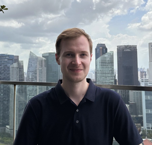
The author profile is the persistent human anchor. Its circular photograph has a thin neutral border and soft portrait shadow; name, role, location, employer, and contact links remain visually subordinate to the page title. On small screens it compacts into a horizontal identity row with a 44px Follow control.
Project Card
Project cards pair a restrained 16:9 media field with title, summary, metadata, pill tags, and plain underlined links. Images use object-fit: contain so project artifacts are shown intact rather than cropped for drama.
Xbox Activity
The Xbox activity block is a signature personal-data component. It uses border-separated rows, compact art and avatar shapes, and Xbox green only for gamerscore and presence information; it must still read as part of the site rather than as an embedded third-party widget.
Do’s and Don’ts
Do:
- Do keep the interface subordinate to real writing, photographs, projects, and current activity.
- Do use Cherry Ember and Deep Terracotta as small, repeatable authorship signals.
- Do maintain both light and dark theme states for every new surface and component.
- Do preserve a 64ch reading measure, responsive stacking, and 44px touch targets.
- Do honor reduced-motion preferences while keeping purposeful motion for everyone else.
Don’t:
- Don’t turn the site into a flashy designer portfolio with full-screen spectacle, ornamental type, excessive animation, or effect-heavy cards.
- Don’t make it resemble a corporate résumé or consulting profile through rigid presentation grids, generic conversion panels, or institutional visual language.
- Don’t flood backgrounds with orange; the Ember family is effective because it is sparse.
- Don’t add heavy shadows, glass effects, or oversized radii that break the crisp, softly layered form language.
- Don’t crop personal or project imagery merely to manufacture drama.